|
DIGITAL
COLOR: THEORY AND PRACTICE
Color
is a powerful, subtle and sometimes fickle tool. Add a little too
much red to your blue, and suddenly you're looking at something
entirely different than what you started with. How does color work,
and what can be done to keep it consistent through digital and mechanical
processes?
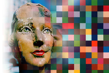
Digital
retouching and manipulation. Final output through a 300dpi Xerox
Electrostatic printer. 60" x 80".
Click to see larger
images. |
 |
|
|
The
human visual system reads color. Light enters the eye, strikes the
retina, and is absorbed by cone cells. The light is then transmitted
to the brain via the optic nerve, where it is interpreted. An important
lesson to draw from this model is that an observer may not actually
see the true color of an object--the observer's cones may not respond
to the exact wavelength. Furthermore, the brain interprets the signal
received from the cones, and that interpretation could be misleading,
hence optical illusions. the three types of cones: long, medium
and short. Long cones are sensitive to red colors (which have long
wavelengths), medium cones are sensitive to green, and short cones
are sensitive to the shortest visible wavelengths, blue colors.
Cone
cells are found mostly at the center of the eye and are unevenly
distributed. Blue cones are rarer than red and green. Rod cells,
which are not sensitive to color, are located around the periphery
of the eye, and are responsible for night vision. Rods and cones
usually do not function at the same time. The eye has a blind spot
where the optic nerve meets the retina. However, this blind spot
is seldom noticed since our eyes are continuously scanning the world
and integrating between snapshots.
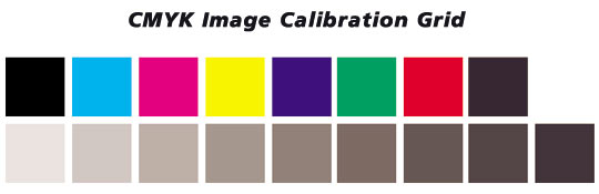
People
are capable of detecting millions of colors--more than desktop printers,
monitors, projectors and printing presses are capable of producing.
To complicate matters, different devices produce different ranges
of colors. Monitors mix light and printers mix ink, and results
often vary. For example, your monitor might be capable of displaying
a color like fire engine red, but to your printer it looks more
like dry rust red. To combat the problem of accurate color reproduction,
sets of device-independent standards have been created. One such
standard was created by the International Color Consortium (ICC)
and has been widely accepted. The ICC standard is based on experiments
conducted by the Commission Internationale de l'Eclairage (CIE),
which tested how people perceive color. Once a standard color space
like ICC is agreed upon, devices can convert their colors to colors
within the space. Problems arise when a device's colors are exotic
flavors of the standard set. These color mismatches are resolved
in a process called gamut mapping, which uses algorithms to convert
extreme colors to standard colors. When everything works, what you
see on your monitor is what you get in print
|